
Reading your seasonal colour report
Undertone, value, chroma — what the three axes of your seasonal report actually mean, and how to spend against the palette without rebuilding your wardrobe.
A colour report is not a list of banned colours. It is a map of where colour helps you and where it starts working against you, and it is built from three measurements taken from your skin, hair and eyes.
Read it once properly and it changes how you shop for years.
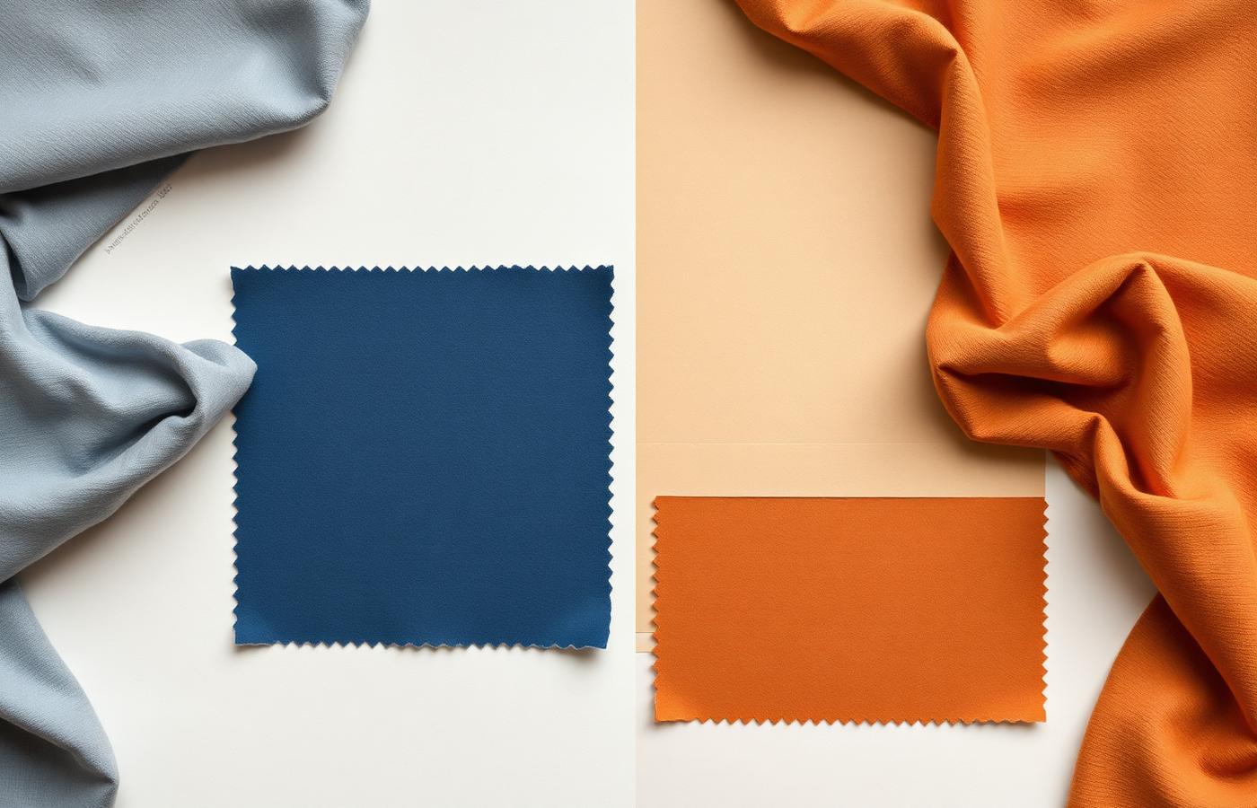
The three axes
Undertone — warm or cool. Not how dark your skin is, but which direction it leans: golden, peach and amber on the warm side; rose, blue and olive on the cool side. Undertone decides whether a colour looks like it belongs to you or sits on top of you.
Value — light or deep. The overall contrast between your skin, hair and eyes. A deep-value person carries near-black and charcoal easily. A light-value person is overwhelmed by them and lifted by mid and pale tones.
Chroma — soft or bright. How much pure saturation your face can take before the colour starts winning the photograph. Soft chroma suits dusty, greyed, muted shades. Bright chroma suits clear, unmixed, high-energy colour.
Those three axes intersect at one of twelve seasons — Light Spring, True Winter, Soft Autumn and the rest. The season name is only shorthand. The three axes are the actual instruction.
Why some colours make you look tired
Skin has its own chroma and value. When a garment sits close to your face at exactly the wrong point on those scales, one of two things happens: the fabric drains you, so shadows under the eyes and around the mouth deepen; or the fabric overpowers you, so the colour is the first thing anyone sees and your features become secondary.
A correct colour does the opposite. Shadows soften, the eyes read clearer, and people compliment you rather than the sweater. Nothing mystical is happening — it is contrast management.
How to use the three swatch groups
Best colours belong near your face. Knitwear, shirts, blouses, scarves, collars, lipstick, frames. This is where the return on getting colour right is highest, because it is the zone people look at while talking to you.
Neutrals are your investment layer. Coats, tailoring, denim, trousers, bags, shoes. Your report will name a specific neutral family — charcoal or chocolate, pure white or cream, black or navy — and that choice quietly determines whether the rest of the wardrobe agrees with itself.
Avoid does not mean forbidden. Move an off-palette colour away from your face and it usually behaves: as trousers, as a skirt, as a jacket over a correct top, as an accessory. Keep the collar right and the rest is negotiable.
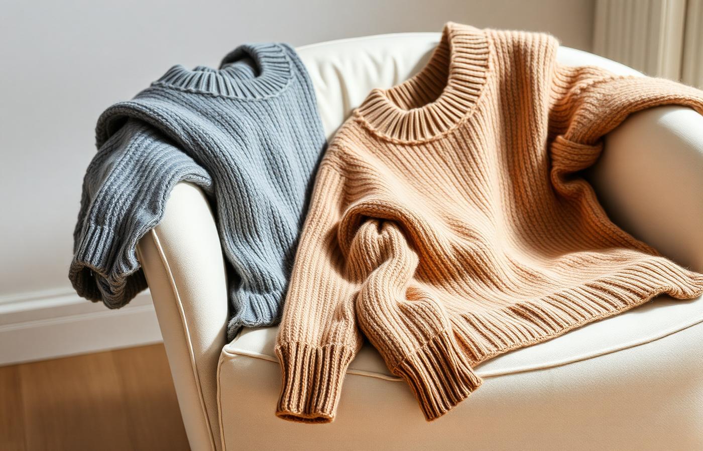
Test in pairs, never alone
Any colour looks plausible in isolation. Hold two candidates up at the jaw in daylight — one from your best list, one you are unsure about — and switch between them. The difference is obvious in comparison and invisible on its own.
This is exactly how the studio's compare mode is meant to be used: two renders, same pose, same light, different colour. Judgement gets easier when the variable is isolated.
Metals, patterns and denim
- Metals. Warm seasons wear gold, brass and copper as if they were skin. Cool seasons wear silver, platinum and white gold. If you own both, notice which one disappears and which one announces itself.
- Patterns. A print works when its dominant colours sit inside your palette and its scale matches your value contrast. High-contrast people can carry graphic prints; low-contrast people are flattered by tonal ones.
- Denim. Denim is a neutral with an undertone. Warm seasons look better in mid and warm-washed indigo; cool seasons look better in true blue, ecru and black.
Fabric changes colour
The same hex value reads differently across materials. Matte wool absorbs light and softens chroma, which suits soft seasons. Satin and sequins reflect it and push chroma up, which suits bright seasons. Linen greys everything slightly. If a colour is borderline for you, choose it in a matte weave and it will often move onto your side of the line.
Spending against the palette
Do not rebuild the wardrobe. Work in this order:
1. Replace the layer that sits at your face first — one or two knits or shirts in your strongest colours.
2. Fix the next coat or jacket you buy to your neutral family.
3. Let off-palette pieces retire naturally rather than discarding them.
4. Before any new purchase, ask which of the three groups it belongs to. If it is a face-adjacent piece in an avoid colour, it is a pass regardless of the price.
Where the report is only a guide
Colour analysis is a set of tendencies, not a law. Occasion, culture, mood and the specific garment all outrank the swatch card. A black tie event asks for black. A uniform asks for the uniform. A colour you love for reasons that have nothing to do with your undertone is still worth wearing — just place it below the shoulders.
Re-run it when you change
Hair colour is one of the three inputs, so a dramatic dye job can move you a full season. So can significant sun exposure, or greying. Regenerate the report after any of those and compare the two side by side; usually the undertone holds and the value and chroma shift.
Read the axes, spend on the face-adjacent layer first, test in pairs. That is the whole practice.